Protected: Twitter Analysis for Minddrive
Password Protected
To view this protected post, enter the password below:

To view this protected post, enter the password below:
 Data visualizations help people make decisions faster and with more accuracy. The sea of Google Analytics data is one area that data visualization can be put to excellent use.
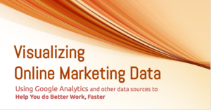
I recently presented to the Kansas City Search Engine Marketing on how to use data visualizations with online marketing data to make more accurate decisions in less time.
After determining which Google Analytics metrics track the activities that matter to the goals and objectives you’ve set for your organization, you (and your clients) can monitor them through custom dashboards and reports. Add the interactivity, context, perspective, notes and visual appeal of data visualization and you’ve just exponentially increased the understandability of those reports: they are engaging and appealing.
Princeton University is one of many non-profits that have traditionally relied on Excel to utilize data from multiple sources to create meaningful reports in their development offices, managing the marriage between the art and the science of fundraising.
They found data visualization moved the science of their fundraising efforts forward. By providing context and significance of their data, patterns, trends and correlations that might go undetected in text-based data was revealed and recognized faster.
The primary benefits of utilizing data visualization for analysis the development departments were:
Data is a resource that is all around, can be shaped to provide new innovations and new  insights and it’s easily mined.
It sometimes feels like we’re suffering from information overload. We have more data than we know what to do with, and in most cases, how to make sense of it.
In his TED talk, David McCandless, a data visualization expert, asks, “Is Data the New Soil?”
Through interactive exploration, data visualizations quickly provide impact and insight.
Equipping management with tools like visualizations that support data-based decision making is becoming a requirement for successful marketing organizations.