
 Data visualizations help people make decisions faster and with more accuracy. The sea of Google Analytics data is one area that data visualization can be put to excellent use.
I recently presented to the Kansas City Search Engine Marketing on how to use data visualizations with online marketing data to make more accurate decisions in less time.
After determining which Google Analytics metrics track the activities that matter to the goals and objectives you’ve set for your organization, you (and your clients) can monitor them through custom dashboards and reports. Add the interactivity, context, perspective, notes and visual appeal of data visualization and you’ve just exponentially increased the understandability of those reports: they are engaging and appealing.
Shown below is the progress of a Google Analytics dashboard, from the default view, to an annotated, branded view, to interactive charts showing perspective for each of the Scorecard numbers in the first dashboard. (Note, only a portion of the dashboard is shown in each case).
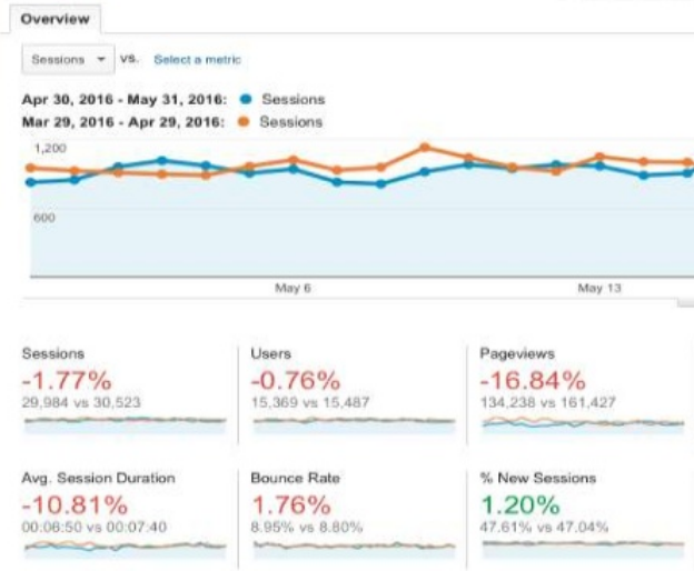
A chart of the number of sessions is in the primary position in this view, with Scorecard figures showing performance during the given range in the rest of the view.
Using two colors, some of the figures are positive and some are negative, with no consistent rules for the colors.
This causes dissonance in the mind of the viewer, rendering the use of color meaningless.
Google is using red and green as the Scorecard numbers.
Since the colors do not have inherent meaning, there shouldn’t be any problems with the six percent of the male population that has color blindness.
Given that Google has integrated accessibility into it’s search algorithm, down-scoring sites that are not accessible, it’s interesting Google Analytics relies so heavy on these two colors.
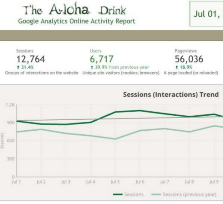
The next version uses branding, including brand colors, and annotated Scorecard numbers (especially helpful for clients).
Positive and negative changes are color coded.
Identified measures are highlighted in different ways – in this view, the main one is a different color than the other Scorecard numbers.
To bring attention to two areas out of view, a shaded box and border was used.
A trend line has been added to show how Sessions are trending for the two time periods shown (in this case, year to year).
In the last view, each of the Scorecard numbers has been charted. Each chart visually conveys change over time and trend, and uses annotations to provide relevance.
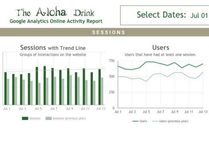
Color and chart type are the most important factors in the charts on the left.
Both color and form are “pre attentive” visual properties – which means they are processed, like all preattentive elements, in spatial memory without our conscious action.
In other words, with preattentive properties, we understand without trying, simply because of the way our brains function.
When data visualization design is done well and preattentive properties are utilized, we understand far faster than when simply looking at numbers, and our brains are freed up to explore questions and interact with the data.
Stephen Few sums up the phenomenon by saying: “The eye and the visual cortex of the brain form a massively parallel processor that provides the highest-bandwidth channel into human cognitive centers. At higher levels of processing, perception and cognition are closely interrelated, which is the reason why the words “understanding” and “seeing” are synonymous.”