
Princeton University is one of many non-profits that have traditionally relied on Excel to utilize data from multiple sources to create meaningful reports in their development offices, managing the marriage between the art and the science of fundraising.
They found data visualization moved the science of their fundraising efforts forward. By providing context and significance of their data, patterns, trends and correlations that might go undetected in text-based data was revealed and recognized faster.
The primary benefits of utilizing data visualization for analysis the development departments were:
- Communicate information more effectively. Visualizations allowed the team to think more holistically about the information they gathered. “It encourages a deeper level of thinking and learning rather than just confirmation,” says Heather Campbell, Associate Director, Development Research Analytics.
- Halve the needed time-to-insight. Once the dashboards are created, the team simply refreshes the data (which takes no more than a few seconds) and gets an updated view. This represents a huge step forward for them, and allows them to same day and answer more questions.
- Enrich engagement with the international alumni community. Mapping international alumni engagement created a visual sense of engagement, and that helped the frontline staff improve its prospecting efforts: it helped them verify that their choices about where to focus their efforts were realistic.
- Minimize the risk of human error. Because the majority of the needed data is available in one place, up-to-date, and pre-formatted, a great deal of time is saved and data quality is preserved.
What if Data Visualizations Could do Even More? What if They Could be used to Save Lives?
In Zambia, data visualization is being used to monitor the location of people affected by malaria and to determine the effectiveness of the elimination strategy.
Each year, about 8,000 people are killed by malaria: half are children under the age of 5.
“The Zambia Ministry of Health and PATH are building an information system that will help people at every level make the types of decisions needed to win this fight,” said Neal Myrick, Tableau’s director of Social Impact and head of the Tableau Foundation. (Until 2014, PATH stood for Program for Appropriate Technology in Health. Now they are simply PATH.)
“The proportion of malaria cases detected and treated by community health workers during transmission season increased to more than half.” said Jeff Bernson, director of Results Management, Measurement, and Learning at PATH.
PATH and Tableau Foundation announced a five-year campaign to eliminate malaria in Zambia. The Visualize No Malaria campaign is rooted in the belief that real-time data about the spread of the disease makes it possible to identify, isolate, and ultimately eliminate the malaria parasite across a region.
Data Visualizations Tell Stories
The Balloons of Bhutan: A Portrait of Happiness in the Last Himalayan Kingdom, by Johnathan Harris, is an innovative story based in data.
Bhutan is the only country in the world that uses “Gross National Happiness” instead of “Gross National Product.”
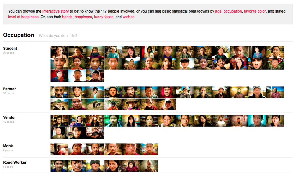
The author traveled to Bhutan and interviewed people about what makes them happy, what wishes they have and how happy they are. He created a beautiful interactive story with sound and visuals that allows you to see inside the hearts of over 100 people.
A foundational concept of data visualization is best said by Innovative IT expert Stephen Few, “The eye and the visual cortex of the brain form a massively parallel processor that provides the highest-bandwidth channel into human cognitive centers. At higher levels of processing, perception and cognition are closely interrelated, which is the reason why the words “understanding” and “seeing” are synonymous.”